
Still creating whole sets based on rejected Topps designs. This time all I had to work with is a rough black and white copy. It seems to have some elements of the 1971 Topps Football, 1975 and 1981 Topps Baseball.

And here is my cleaned up version with an action shot of Wayne Garrett striking pose similar to the mock-up. After cleaning it up and creating more base cards, the final product looked less like a mainstream Topps product and more like a giveaway found in a loaf of Wonder Bread.

As usual, I also made base cards of the MVPs and Cy Young award winners from both leagues. I went with a horizontal version for Randy Jones.

For Munson I include a cameo of one of the most famous 'fros in baseball.

Speaking of hair, I used this cap-less shot of Palmer to show off his disco era locks.

I also tried to stay true to the team colors Topps used in 1976. These colors worked for the Padres and the Mets. They were passable for the Yankees. But the Reds and Orioles? Ugh.
 Still creating whole sets based on rejected Topps designs. This time all I had to work with is a rough black and white copy. It seems to have some elements of the 1971 Topps Football, 1975 and 1981 Topps Baseball.
 And here is my cleaned up version with an action shot of Wayne Garrett striking pose similar to the mock-up. After cleaning it up and creating more base cards, the final product looked less like a mainstream Topps product and more like a giveaway found in a loaf of Wonder Bread.
 As usual, I also made base cards of the MVPs and Cy Young award winners from both leagues. I went with a horizontal version for Randy Jones.
  For Munson I include a cameo of one of the most famous 'fros in baseball.
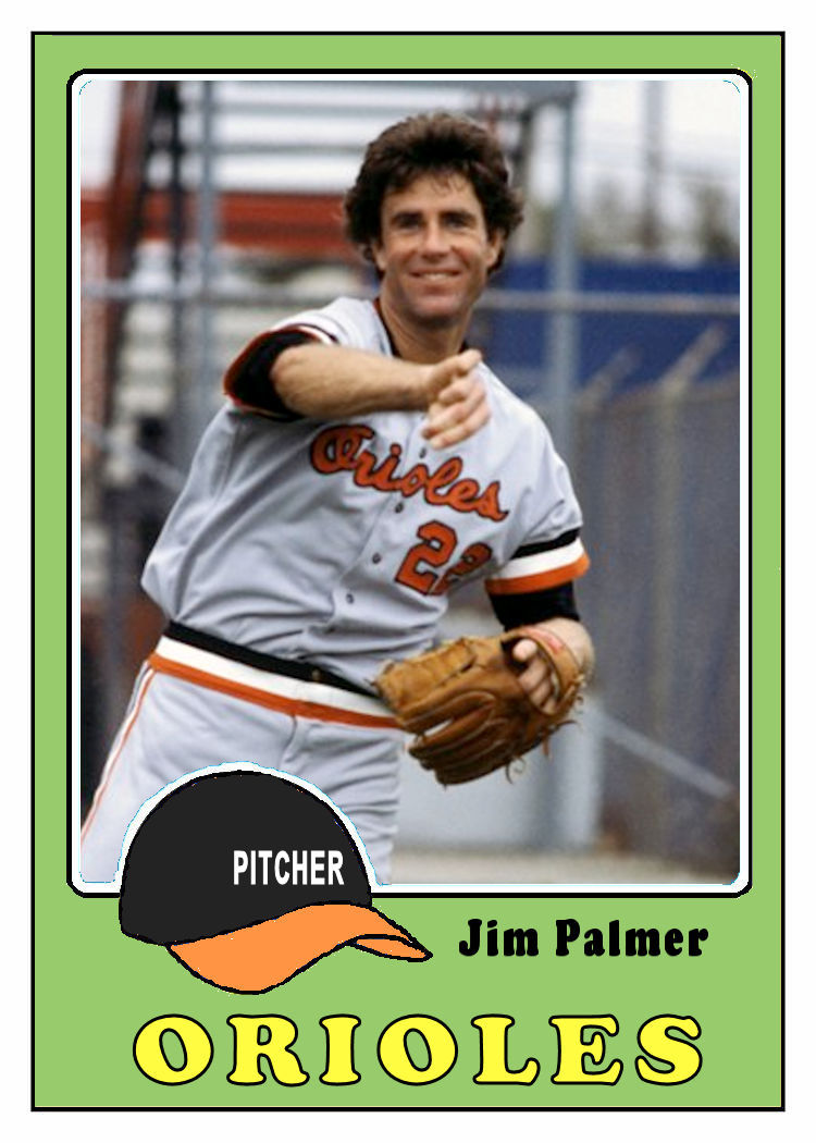 Speaking of hair, I used this cap-less shot of Palmer to show off his disco era locks.
 I also tried to stay true to the team colors Topps used in 1976. These colors worked for the Padres and the Mets. They were passable for the Yankees. But the Reds and Orioles? Ugh.
Very nice. What about an all-star card in this format?
ReplyDeleteMore to come. Stay tuned.
DeleteAh, the mid 70's: Disco, polyester leisure suits & this stuff!! Good to see you're at it again! These samples show that you've put in good effort massaging what is (compared to the 64 & 72) basically a sub-par design. Despite that,you've come up with some acceptable cards. The
ReplyDelete"Munson" with Gamble comin' in is just a great shot. My appreciation again "Buzz" (Bryant)
I'm thankful that between 1976 and 1981 Topps figured out that the cap should have the team name!
ReplyDelete